This is a good post on making visualisations with pandas data frame in Python. It covers uni-variate plots like histograms, line plots, density plots and multivariate plots like correlation plot matrix and scatter-plot matrix.
Before diving into feature engineering and data cleaning, it is a good idea to have a good understanding of the data.
- Does it contain empty fields or missing values
- Are the values meaningful or feasible, like age of a person being negative or something like 99999
- Does it contain significant number of outliers and do they follow any pattern
We will cover how to deal with incomplete rows, missing values, outliers and similar preprocessing tasks in a future post.
You will need for the following R packages :
- ggplot2 – For beautiful plots and histograms
- igraph – For working with graphs(set of nodes and set of edges) and also for visualizing it. It will be preliminary, so for detailed view, use Gephi. It is available for free.
I recommend you to go through this post for in-depth analysis.
In R, commands like str and summary help us achieve it.
Here, we use the Dress Attribute Sales dataset from UCI ML
str – Gives the schema of the data set, i.e, features, its levels(if categorical) and its data type
dress_data = = read.csv(file = "~/Downloads/Attribute DataSet.csv", header = TRUE, stringsAsFactors = FALSE)
str(dress_data)
'data.frame': 500 obs. of 14 variables:
$ Dress_ID : int 1006032852 1212192089 1190380701 966005983 876339541 1068332458 1220707172 1219677488 1113094204 985292672 ...
$ Style : chr "Sexy" "Casual" "vintage" "Brief" ...
$ Price : chr "Low" "Low" "High" "Average" ...
$ Rating : num 4.6 0 0 4.6 4.5 0 0 0 0 0 ...
$ Size : chr "M" "L" "L" "L" ...
$ Season : chr "Summer" "Summer" "Automn" "Spring" ...
$ NeckLine : chr "o-neck" "o-neck" "o-neck" "o-neck" ...
$ SleeveLength : chr "sleevless" "Petal" "full" "full" ...
$ waiseline : chr "empire" "natural" "natural" "natural" ...
$ Material : chr "null" "microfiber" "polyster" "silk" ...
$ FabricType : chr "chiffon" "null" "null" "chiffon" ...
$ Decoration : chr "ruffles" "ruffles" "null" "embroidary" ...
$ Pattern.Type : chr "animal" "animal" "print" "print" ...
$ Recommendation: int 1 0 0 1 0 0 0 0 1 1 ...
summary – Aggregate information of each column of the dataset, containing detals like mean, median, 1st and 3rd quartile, number of NA’s
summary(dress_data)
Dress_ID Style Price Rating Size Season
Min. :4.443e+08 Length:500 Length:500 Min. :0.000 Length:500 Length:500
1st Qu.:7.673e+08 Class :character Class :character 1st Qu.:3.700 Class :character Class :character
Median :9.083e+08 Mode :character Mode :character Median :4.600 Mode :character Mode :character
Mean :9.055e+08 Mean :3.529
3rd Qu.:1.040e+09 3rd Qu.:4.800
Max. :1.254e+09 Max. :5.000
NeckLine SleeveLength waiseline Material FabricType Decoration
Length:500 Length:500 Length:500 Length:500 Length:500 Length:500
Class :character Class :character Class :character Class :character Class :character Class :character
Mode :character Mode :character Mode :character Mode :character Mode :character Mode :character
Pattern.Type Recommendation
Length:500 Min. :0.00
Class :character 1st Qu.:0.00
Mode :character Median :0.00
Mean :0.42
3rd Qu.:1.00
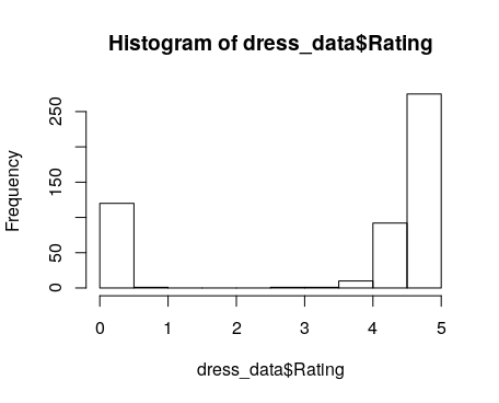
Max. :1.00We can also construct visualisations of our data using line plots, scatter plots and histogram in R.
hist(dress_data$Rating)